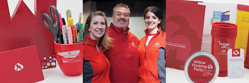
For the past year, we’ve been getting in touch with our inner client, turning our process on ourselves, and watching who we are as a brand unfold. We’re not gonna lie. It’s a little nerve-racking sitting on the client side of the table with giddy anticipation, both excited and uncertain of how it will all turn out. We had forgotten what it feels like to wipe the slate clean and step out on the ledge of trust with someone to reimagine your brand. But how else would we have approached a Willow rebrand?

That’s right, no one is seeing red anymore. Or the infamous (some have said ambiguous) willow tree. Why? See if any of these reasons sound familiar:
- Our outward brand didn’t match our inward personality. (Would you wear the same sweater you wore 25 years ago?)
- A key organizational goal was to get more intentional about how we market ourselves. (Cobbler’s kids, painter’s house, you get the idea.)
- We’re hitting a significant milestone—25 years in the business. (Stay tuned for more news on our yearlong celebration.)

When we decided to rebrand we knew we were too “in the jar” to objectively read our own label. So we called in a trusted industry friend to play our role as researcher. Nila Nealy, an accomplished branding consultant, took us through a discovery process similar to our own that included a SWOT analysis, collaborative staff sessions, internal and external interviews, and projective exercises.
Asking people to describe a brand as an inanimate object often reveals brand attributes—the functional and emotional associations assigned to a brand by its customers or audience. As a part of the discovery process, Nila first took our staff and then a group of clients through two of these projective exercises where she asked, “What kind of cereal is Willow?” and “What household appliance or electronic is Willow?”
Our clients described us as everything from a Bluetooth speaker (“Meets us wherever we are…”) to a Dremel (“Fits in a lot of places, many attachments”). Nila’s big takeaway?
“With appliances/electronics, the key theme was utility. This indicates a work ethic of making sure everything you do is practical and useful, not just for show.”
That aligned nicely with our core values of helpful and humble, so it really felt good to hear it from others.

As for cereal? It appears we’re a combination of whole grain cereal (good for you, classic, wholesome) and sweet magical surprises (variety, creativity, fun). Which explains why Lucky Charms was the cereal most frequently chosen to represent us. Nila’s caution to us was to be careful that our “we do it all” approach didn’t overshadow our expertise in any one area. That was solid advice.

After a few times going through those, a theme started to emerge that later became the Making Things Better rallying cry, where each word has a deeper meaning. Making indicates the action or craftsmanship of creating. Things is open to all the possibilities—a website, your brand, even your day! And Better? Better never stops being, never stops trying. Even what’s considered your best today, can get better tomorrow. Like Toyota’s Kaizen (continuous improvement model), better never settles.
Mandy Haskett, our director of strategy, will share more of our behind-the-scenes look in part two of this four-part series.
